Maths · Statistics
Knowledge organiser
The whole chapter on one page. Print it on A4 — it is already landscape — or cover a box and see how much of it you can say from memory.
Maths · Edexcel Paper 2
Statistics
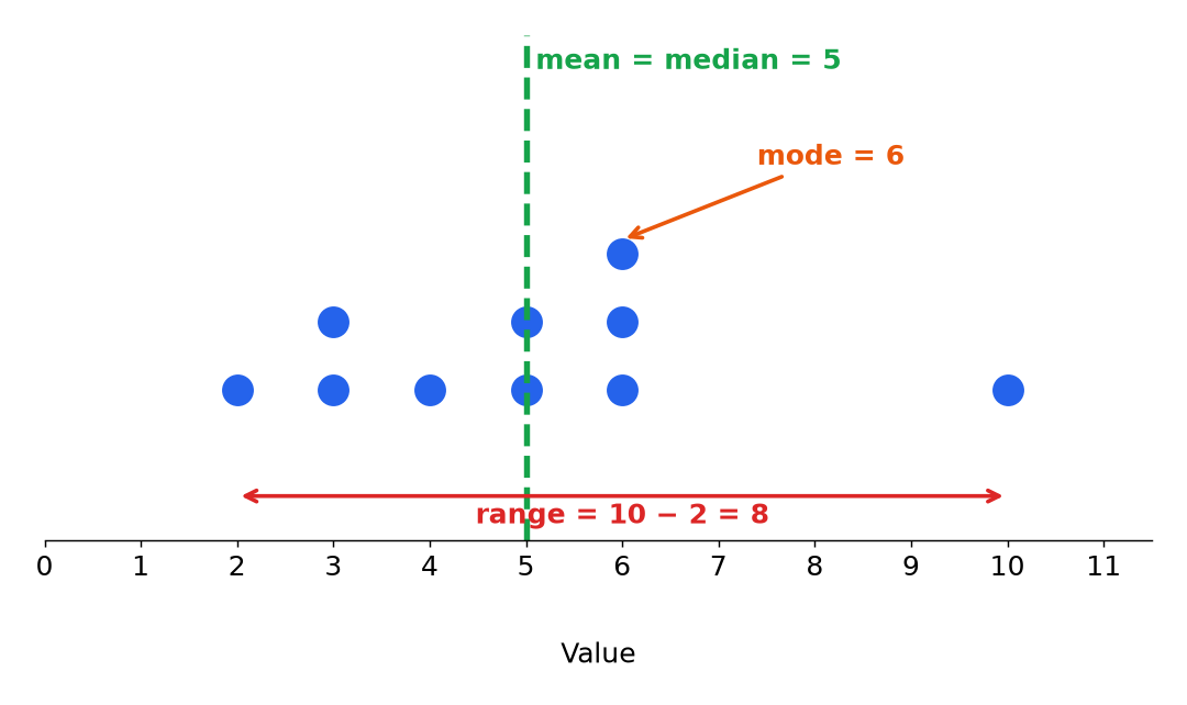
Averages and Range
Finding the mean, median, mode and range, using frequency tables and grouped data, and choosing the best average.
- Mean The sum of the values divided by how many there are.
- Median The middle value when the data is in order.
- Mode The value that occurs most often.
Pie Charts, Bar Charts and Stem-and-Leaf Diagrams
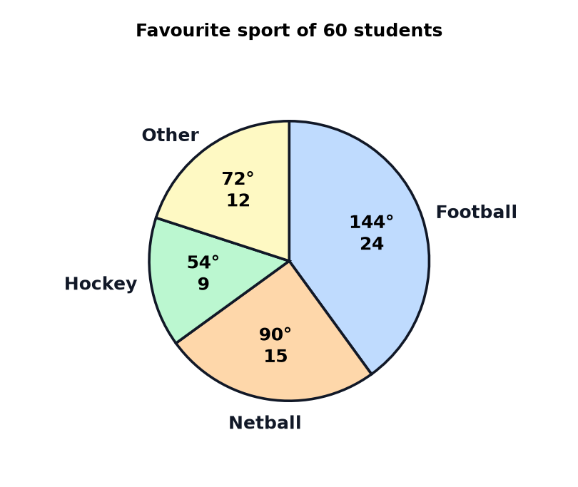
Drawing and reading pie charts, bar charts and stem-and-leaf diagrams, and spotting misleading charts.
- Pie chart A circular chart where the angle of each sector represents its share of the total.
- Sector A slice of a pie chart.
- Bar chart A chart that uses bars of different heights to show frequencies.
Scatter Graphs
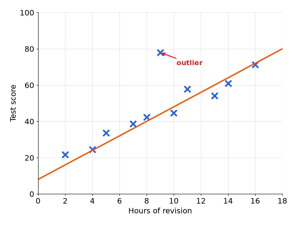
Describing correlation, using lines of best fit to estimate, and judging how reliable an estimate is.
- Scatter graph A graph of plotted points showing how two variables are related.
- Correlation The relationship between two variables.
- Positive correlation Both variables increase together.
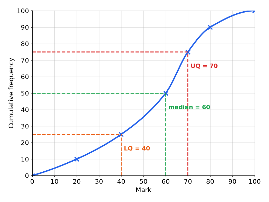
Cumulative Frequency and Box Plots (Higher tier)
Drawing and reading cumulative frequency graphs, finding quartiles, and comparing distributions with box plots.
- Cumulative frequency The running total of the frequencies.
- Quartile A value that divides the ordered data into four equal parts.
- Lower quartile The value a quarter of the way through the ordered data.
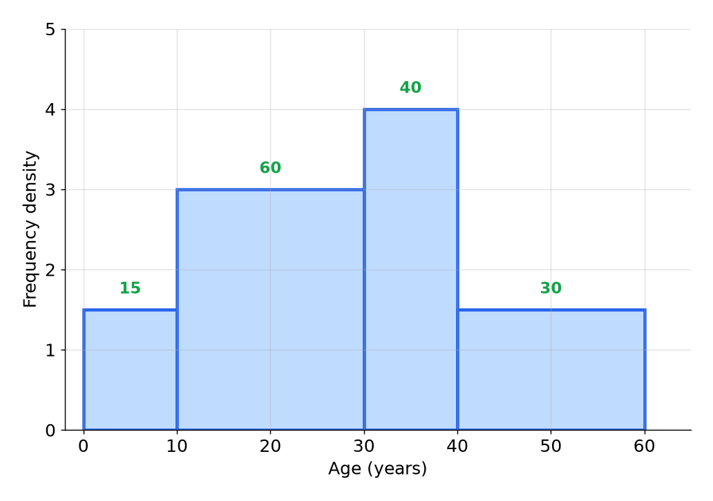
Histograms and Sampling
Using frequency density to draw and read histograms, and taking random, stratified and capture-recapture samples.
- Histogram A chart with touching bars where the area of each bar shows the frequency.
- Frequency density Frequency divided by class width, used as the height of a histogram bar.
- Class width The size of a class, found by subtracting its lower boundary from its upper boundary.