Maths · Statistics
Viewing as
Teaching this? The teacher view opens every answer and mark scheme.
Cumulative Frequency and Box Plots
Drawing and reading cumulative frequency graphs, finding quartiles, and comparing distributions with box plots.
Learning Objectives
- 1Complete a cumulative frequency table and draw a cumulative frequency graph.
- 2Use the graph to estimate the median, the lower and upper quartiles, and the interquartile range.
- 3Read the number of values above or below a given value from a cumulative frequency graph.
- 4Draw and interpret box plots, and use them to compare two distributions.
Running totals and spread
A cumulative frequency graph plots a running total, so that you can read off how many values are below any given value. From it you can find the median and the quartiles, and from those the interquartile range, which is a measure of spread that ignores extreme values. A box plot then shows five numbers at once. Both are Higher tier content, and comparing two distributions in words, using a median and a measure of spread, is a skill the mark scheme rewards every time.
Cumulative frequency tables and graphs
Cumulative frequency means adding up the frequencies as you go.
-
The table
Add each frequency to the total of all those before it. Frequencies 10, 15, 25, 20, 30 give cumulative frequencies 10, 25, 50, 70, 100.
-
Plot at the upper boundary
For the class \(20 < x \leq 40\), plot the cumulative frequency at \(x = 40\), the end of the class.
-
Join with a smooth curve
Start at the lowest value with a cumulative frequency of 0.
-
Check the last point
The last cumulative frequency is the total number of values.
Reading a cumulative frequency graph
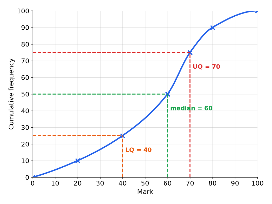
There are 100 values. The median is the middle value, at cumulative frequency 50. The lower quartile is at \(\dfrac{1}{4}\) of the way, 25, and the upper quartile is at \(\dfrac{3}{4}\) of the way, 75.
Reading the graph
- Median Go across from \(\dfrac{n}{2} = 50\) to the curve, then down: 60.
- Lower quartile (LQ) Across from \(\dfrac{n}{4} = 25\), then down: 40.
- Upper quartile (UQ) Across from \(\dfrac{3n}{4} = 75\), then down: 70.
- Interquartile range \(\text{UQ} - \text{LQ} = 70 - 40 = 30\).
Estimating from the graph
Use the graph above to estimate the number of students who scored more than 80 marks.
Show the solutionHide the solution
- 1 Find the cumulative frequency at 80 Go up from a mark of 80 to the curve, and across: 90.
- 2 Think about what it means 90 students scored 80 or less.
- 3 Subtract from the total \(100 - 90 = 10\).
- 4 Write the answer About 10 students scored more than 80.
Answer10
Quartiles and the interquartile range
The interquartile range measures the spread of the middle half of the data.
-
Why use it
It is not affected by extreme values, unlike the range.
-
A smaller IQR
The middle half of the data is more tightly bunched, so the data is more consistent.
-
Percentiles
The 90th percentile is at cumulative frequency \(0.9n\), and so on.
-
Always show the lines
Draw construction lines on the graph to show where you read the values.
Comparing with box plots
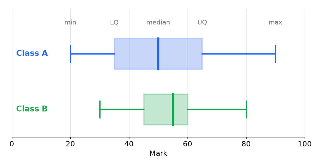
A box plot shows five numbers: the minimum, lower quartile, median, upper quartile and maximum. The box covers the middle half of the data, and the line in the box is the median.
Comparing the classes
- Medians Class B has the higher median, 55 against 50, so its typical mark is higher.
- Interquartile ranges Class A has \(65 - 35 = 30\), and Class B has \(60 - 45 = 15\).
- Ranges Class A has \(90 - 20 = 70\), and Class B has \(80 - 30 = 50\).
- Conclusion Class B has a higher median and is more consistent, with a smaller IQR.
Writing a comparison
Marks are for two statements, one about an average and one about spread, both with numbers and the context.
-
Compare the averages
"The median mark for Class B is higher, 55 compared with 50."
-
Compare the spread
"Class B has a smaller interquartile range, 15 compared with 30, so its marks are more consistent."
-
Use the words of the question
Write "marks", "class" or "time", not just "it".
-
Do not describe separately
Make comparisons with a word such as "higher", "lower" or "than".
Drawing a box plot from a cumulative frequency graph
From a cumulative frequency graph of 80 values, the minimum is 3, the lower quartile is 20, the median is 30, the upper quartile is 40 and the maximum is 58. State the five numbers and the interquartile range.
Show the solutionHide the solution
- 1 The five numbers Minimum 3, LQ 20, median 30, UQ 40, maximum 58.
- 2 Draw A box from 20 to 40, with a line at 30, and whiskers to 3 and 58.
- 3 Interquartile range \(40 - 20 = 20\).
- 4 Range \(58 - 3 = 55\).
Answer3, 20, 30, 40, 58; IQR 20
Test yourself
-
1
What does cumulative frequency mean?
Show answerHide answer
A running total of the frequencies.
-
2
Where do you plot a cumulative frequency point for a class?
Show answerHide answer
At the upper class boundary.
-
3
Where is the median on a cumulative frequency graph of \(n\) values?
Show answerHide answer
At cumulative frequency \(\dfrac{n}{2}\).
-
4
How do you find the interquartile range?
Show answerHide answer
Upper quartile minus lower quartile.
-
5
Which is not affected by extreme values, the range or the interquartile range?
Show answerHide answer
The interquartile range.
Exam technique: cumulative frequency and box plots
Show the construction lines and the comparison.
-
Mark the lines on the graph
Examiners credit the reading only if the lines show the method.
-
Read to the nearest half square
Accept answers within a range.
-
Compare using an average and a spread
A median and an IQR, both with numbers.
-
Say "more consistent" correctly
A smaller IQR or range means more consistent, not "lower".
Summary and exam focus
- Cumulative frequency is a running total, plotted at the upper class boundaries and joined with a smooth curve.
- The median, lower quartile and upper quartile are read at \(\dfrac{n}{2}\), \(\dfrac{n}{4}\) and \(\dfrac{3n}{4}\).
- The interquartile range is UQ minus LQ.
- A box plot shows the five numbers, and a comparison needs an average and a spread, with numbers.
Exam focus
A cumulative frequency graph shows the heights of 80 plants. The lower quartile is 20 cm and the upper quartile is 40 cm. Work out the interquartile range. (1 mark) (1 marks)
The interquartile range is \(40 - 20 = 20\) cm. Do not give the range (maximum minus minimum), and do not forget the units.
Key terms
The words this lesson expects you to use. Each one is linked from the first place it appears above.
- Cumulative frequency
- The running total of the frequencies.
- Quartile
- A value that divides the ordered data into four equal parts.
- Lower quartile
- The value a quarter of the way through the ordered data.
- Upper quartile
- The value three quarters of the way through the ordered data.
- Interquartile range
- The upper quartile minus the lower quartile.
- Box plot
- A diagram that shows the minimum, quartiles, median and maximum.
- Percentile
- A value that divides the data into 100 equal parts.
- Distribution
- The way data is spread out.
- Consistent
- Closely grouped, with little variation.
You've finished the notes
Check your understanding
Test yourself while it is fresh. Start with the flashcards, then try the exam questions.
Something here looks wrong?
Tell us what and we will go and look. It goes to whoever writes these pages, nobody else, and we do not ask who you are — so there is nothing to sign and nothing comes back to you.