Maths · Statistics
Viewing as
Teacher view: every answer and mark scheme set out in full.
Scatter Graphs
Describing correlation, using lines of best fit to estimate, and judging how reliable an estimate is.
Learning Objectives
- 1Plot a scatter graph and describe the correlation between two variables.
- 2Draw a line of best fit and use it to estimate values.
- 3Describe the relationship in words, interpret the gradient and spot outliers.
- 4Explain the difference between correlation and causation, and between interpolation and extrapolation.
Looking for a link
A scatter graph plots two measurements for each person or object, such as hours of revision and test score, to see whether there is a connection. The pattern of the points is called the correlation, and a line of best fit lets you make predictions. Scatter graph questions on Paper 1 are mostly reading and describing, because drawing a line by eye is awkward without more equipment, so you must be able to use a given line carefully, say how reliable an estimate is, and avoid claiming that one thing causes another.
Types of correlation
The shape of the points tells you the type of relationship.
-
Positive correlation
As one variable increases, the other increases. The points slope up from left to right.
-
Negative correlation
As one variable increases, the other decreases. The points slope down.
-
No correlation
The points are scattered with no pattern.
-
Strength
The closer the points are to a straight line, the stronger the correlation.
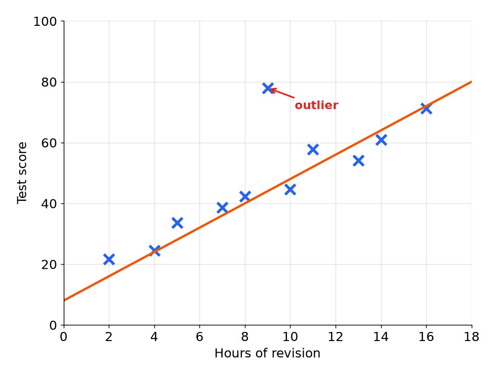
A scatter graph with a line of best fit
The points show positive correlation: more revision usually means a higher score. The line of best fit goes through the middle of the points, with about as many above it as below it, and it does not have to go through the origin.
Reading the graph
- Describe the correlation "As hours of revision increase, the test score increases" is a full answer.
- Outlier The point at about 9 hours and a score of 78 does not fit the pattern, and may be an error or an unusual case.
- Gradient The line rises from 8 to 80 over 18 hours, a gradient of \(\dfrac{72}{18} = 4\), so each extra hour adds about 4 marks.
- Intercept The line starts at about 8 marks, the estimated score with no revision.
Drawing and using a line of best fit
A line of best fit is a straight line that follows the trend.
-
Drawing it
Use a ruler. It should pass close to as many points as possible and have roughly equal numbers of points on each side. Ignore any outliers.
-
Estimating
To estimate \(y\) for a given \(x\), go up from \(x\) to the line, then across to the \(y\)-axis. Draw lines on the graph to show it.
-
Using the equation
The line \(y = 4x + 8\) gives a score of \(4 \times 12 + 8 = 56\) for 12 hours of revision.
-
Round sensibly
Estimates are not exact, so accept a range, and say "about".
Estimating from a line of best fit
The line of best fit on a scatter graph passes through \((0, 8)\) and \((18, 80)\). Estimate the test score of a student who revises for 12 hours.
Show the solutionHide the solution
- 1 Find the gradient \(\dfrac{80 - 8}{18 - 0} = 4\).
- 2 Write the equation \(y = 4x + 8\).
- 3 Substitute \(y = 4 \times 12 + 8 = 56\).
- 4 Check on the graph Going up from 12 hours to the line and across gives about 56.
AnswerAbout 56
How reliable is an estimate?
Examiners ask whether an estimate is reliable and why.
-
Interpolation
An estimate inside the range of the data, such as 12 hours when the data runs from 2 to 16 hours. This is reasonably reliable.
-
Extrapolation
An estimate outside the range, such as 25 hours of revision. It is not reliable, because the pattern may not continue. The line would give 108, which is above the maximum possible score of 100.
-
Strong correlation
The closer the points are to the line, the more reliable the estimates.
-
Small samples
Few points mean the line is less trustworthy.
Correlation and causation
Two things moving together does not mean that one causes the other.
-
Correlation
A link between two variables.
-
Causation
One variable making the other change.
-
Third factor
Ice cream sales and sunburn are correlated, but hot weather causes both.
-
Say it carefully
"There is a positive correlation" is safe. "More revision causes higher scores" needs more evidence.
Test yourself
-
1
What type of correlation has points sloping downwards from left to right?
Show answerHide answer
Negative.
-
2
What is an outlier?
Show answerHide answer
A point that does not fit the pattern of the others.
-
3
What does interpolation mean?
Show answerHide answer
Estimating within the range of the data.
-
4
Why is extrapolation unreliable?
Show answerHide answer
The pattern may not continue outside the range of the data.
-
5
Does correlation prove causation?
Show answerHide answer
No, there may be another factor, or it may be a coincidence.
Exam technique: scatter graphs
Be clear and use the context.
-
Use the variable names
"As temperature increases, ice creams sold increase" is better than "positive correlation" alone.
-
Draw on the graph
Show construction lines for any reading.
-
Comment on reliability
Say whether the estimate is inside or outside the range.
-
Use a ruler
A line of best fit should be straight and pass through the middle of the points.
Summary and exam focus
- Correlation can be positive, negative or none, and strong or weak.
- A line of best fit passes through the middle of the points and is used to estimate values.
- Interpolation is reliable, and extrapolation is not.
- Correlation does not prove causation.
Exam focus
The scatter graph shows the age of a car and its value, and has negative correlation. Describe the relationship between the age of a car and its value. (1 mark) (1 marks)
Write "As the age of the car increases, its value decreases." Using the two quantities in the sentence is what earns the mark, and "negative correlation" on its own may not be enough.
Key terms
The words this lesson expects you to use. Each one is linked from the first place it appears above.
- Scatter graph
- A graph of plotted points showing how two variables are related.
- Correlation
- The relationship between two variables.
- Positive correlation
- Both variables increase together.
- Negative correlation
- One variable increases as the other decreases.
- Line of best fit
- A straight line drawn through the middle of the points on a scatter graph.
- Outlier
- A point that does not fit the pattern.
- Interpolation
- Estimating a value within the range of the data.
- Extrapolation
- Estimating a value outside the range of the data.
- Causation
- When one thing makes another happen.
Questions and answers
15 questions set on this lesson, with the mark schemes and model answers open.
Write down the type of correlation between (a) the number of hours of sunshine and the sales of sun cream, (b) the age of a car and its value.
Mark scheme — 2 marks available
- (a) Positive — B1
- (b) Negative — B1
Model answer
(a) Positive correlation. (b) Negative correlation.
The scatter graph shows the hours of sunshine in a week and the number of plants sold by a garden centre in that week. A line of best fit is drawn. (a) Describe the correlation. (1 mark) (b) In one week there were 20 hours of sunshine. Use the line of best fit to estimate the number of plants sold. (2 marks) (c) Gavin uses the line to estimate the number of plants sold in a week with 60 hours of sunshine. Comment on the reliability of his estimate. (2 marks)
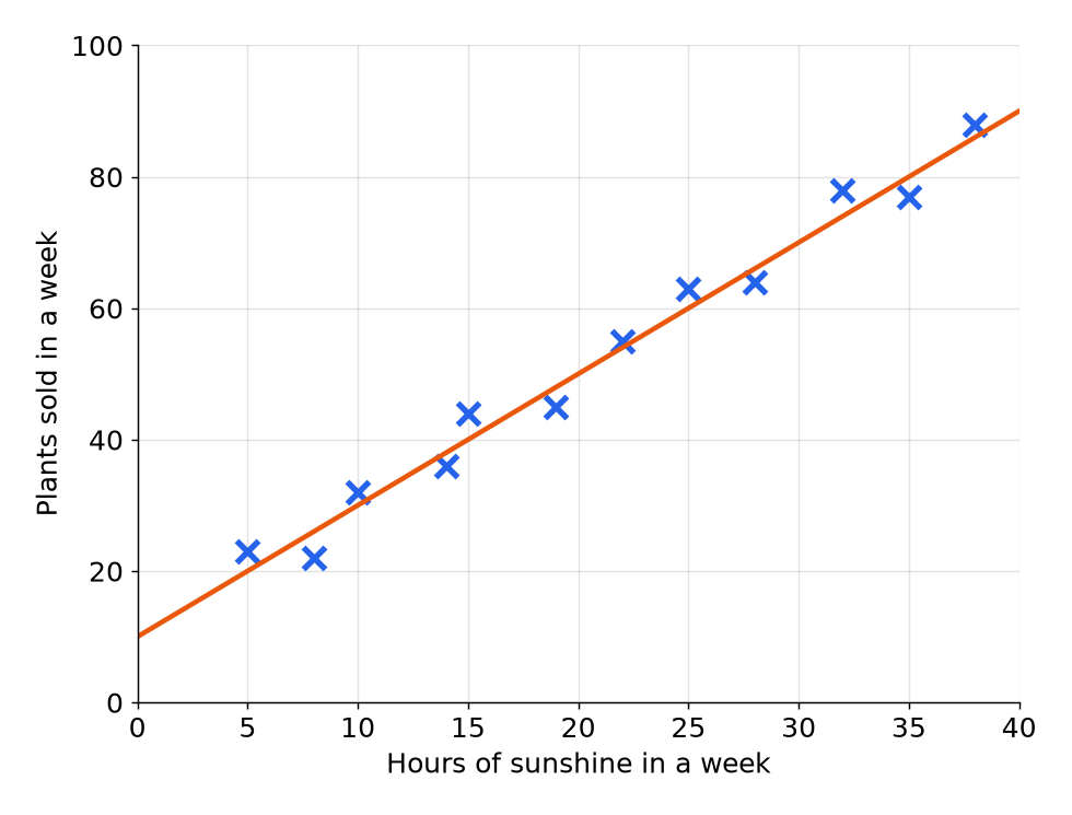
Mark scheme — 5 marks available
- (a) Positive, in context — B1
- (b) A line drawn up from 20 to the line of best fit and across — M1
- (b) 50 (accept 48 to 52) — A1
- (c) States that the estimate is not reliable — B1
- (c) Explains that 60 is outside the range of the data — B1
Model answer
(a) Positive correlation: as the hours of sunshine increase, the number of plants sold increases. (b) Going up from 20 hours to the line and across gives 50 plants. (c) The estimate is not reliable. 60 hours is outside the range of the data, so this is extrapolation and the pattern may not continue.
A line of best fit for the revision time, \(x\) hours, and the test score, \(y\), has the equation \(y = 3x + 5\). (a) Use the equation to estimate the score for 8 hours of revision. (1 mark) (b) What does the number 3 in the equation represent? (1 mark) (c) What does the number 5 in the equation represent? (1 mark)
Mark scheme — 3 marks available
- (a) 29 — B1
- (b) The score increases by 3 for each extra hour — B1
- (c) The estimated score with 0 hours of revision — B1
Model answer
(a) \(3 \times 8 + 5 = 29\). (b) The score goes up by about 3 marks for each extra hour of revision. (c) The estimated score with no revision.
There is a positive correlation between ice cream sales and the number of people with sunburn. Hay says, “Eating ice cream causes sunburn.” Comment on what Hay says.
Mark scheme — 2 marks available
- States that correlation does not prove causation — B1
- Gives a third factor such as hot weather — B1
Model answer
Hay is not necessarily correct. Correlation does not mean causation. Hot, sunny weather causes both ice cream sales and sunburn to increase.
These are points on a scatter graph: \((1, 3)\), \((2, 4)\), \((3, 5)\), \((4, 6)\) and \((5, 15)\). (a) Write down the outlier. (1 mark) (b) Say how this should affect the line of best fit. (1 mark)
Mark scheme — 2 marks available
- (a) \((5, 15)\) — B1
- (b) It should be ignored — B1
Model answer
(a) \((5, 15)\), as it is far from the pattern of the other points. (b) The outlier should be ignored when the line of best fit is drawn.
A line of best fit goes through the points \((10, 30)\) and \((30, 70)\). (a) Work out the equation of the line. (3 marks) (b) Use your equation to estimate \(y\) when \(x = 25\). (1 mark)
Mark scheme — 4 marks available
- (a) Gradient \(\dfrac{40}{20}\) — M1
- (a) Substitutes a point to find \(c\) — M1
- (a) \(y = 2x + 10\) — A1
- (b) 60 — B1 (follow through from (a))
Model answer
(a) The gradient is \(\dfrac{70 - 30}{30 - 10} = 2\). Then \(30 = 2 \times 10 + c\), so \(c = 10\) and \(y = 2x + 10\). (b) \(2 \times 25 + 10 = 60\).
What type of correlation has points sloping downwards from left to right?
Why: One variable falls as the other rises.
Which statement describes positive correlation?
Why: Positive correlation slopes upwards.
What is an outlier?
Why: Outliers are far from the trend.
A line of best fit has equation \(y = 4x + 8\). Estimate \(y\) when \(x = 12\).
Why: \(4 \times 12 + 8 = 56\).
Data runs from 2 to 16 hours of revision. What do we call an estimate for 25 hours?
Why: Outside the range of the data is extrapolation.
Which estimate is likely to be more reliable?
Why: Interpolation is more reliable than extrapolation.
Ice cream sales and sunburn are positively correlated. What is the best explanation?
Why: A third factor can cause both.
The line of best fit is \(y = 4x + 8\), where \(x\) is hours of revision and \(y\) is the test score. What does the gradient mean?
Why: The gradient is the change in score for each extra hour.
In \(y = 4x + 8\), what does 8 represent?
Why: It is the \(y\)-intercept, the value when \(x = 0\).