Maths · Statistics
Viewing as
Teacher view: every answer and mark scheme set out in full.
Pie Charts, Bar Charts and Stem-and-Leaf Diagrams
Drawing and reading pie charts, bar charts and stem-and-leaf diagrams, and spotting misleading charts.
Learning Objectives
- 1Read, draw and interpret pie charts, including finding angles and frequencies.
- 2Read bar charts and compare data, including dual bar charts.
- 3Construct and interpret stem-and-leaf diagrams, and find the median, mode and range from one.
- 4Spot misleading features in a chart.
Showing data clearly
A good chart lets the reader see a pattern at a glance, and examiners test whether you can both read a chart accurately and decide what it shows. Pie charts are about angles and fractions, bar charts are about heights, and stem-and-leaf diagrams keep every value while sorting them into order. All three need careful reading of the key and scale, and all the numbers are chosen to be easy: a pie chart of 60 people has 6 degrees for each person, and 360 divides neatly by 36, 40, 60, 72 and 120.
Pie charts
A pie chart shows how a whole is shared out, with the angle of each sector proportional to its frequency.
-
Angle for a sector
\(\dfrac{\text{frequency}}{\text{total}} \times 360^\circ\).
-
Degrees for each item
Work out \(\dfrac{360}{\text{total}}\) first. For 60 students, each is \(6^\circ\).
-
Frequency from an angle
\(\dfrac{\text{angle}}{360} \times \text{total}\). In a pie chart of 36 people, \(100^\circ\) is \(\dfrac{100}{360} \times 36 = 10\) people.
-
Check
The angles add up to \(360^\circ\), and so do the frequencies for the total.
A pie chart
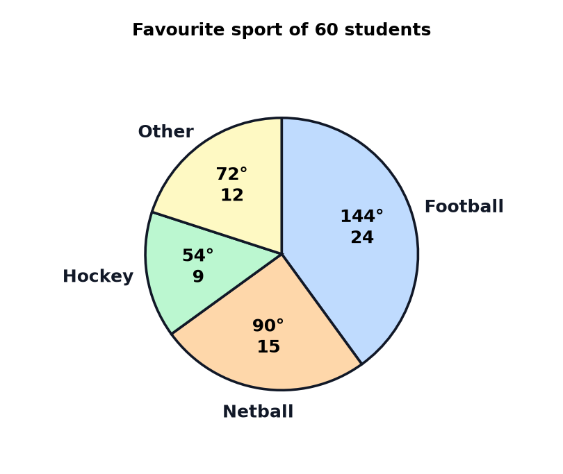
With 60 students, each is \(\dfrac{360}{60} = 6^\circ\), so football's 24 students make \(24 \times 6 = 144^\circ\). The same method works backwards.
Using the pie chart
- Football \(24 \times 6 = 144^\circ\).
- Hockey \(9 \times 6 = 54^\circ\), the green sector.
- Fraction Netball is \(\dfrac{90}{360} = \dfrac{1}{4}\) of the students, which is 15.
- Percentage Hockey is \(\dfrac{54}{360} = 15\%\).
Drawing a pie chart
40 students choose their favourite fruit: apple 16, banana 12, pear 8, grape 4. Work out the angle for each sector.
Show the solutionHide the solution
- 1 Degrees per student \(\dfrac{360}{40} = 9^\circ\).
- 2 Multiply Apple \(16 \times 9 = 144\), banana \(12 \times 9 = 108\), pear \(8 \times 9 = 72\), grape \(4 \times 9 = 36\).
- 3 Check \(144 + 108 + 72 + 36 = 360\).
- 4 Draw Use a protractor and label each sector.
AnswerApple \(144^\circ\), banana \(108^\circ\), pear \(72^\circ\), grape \(36^\circ\)
Bar charts
A bar chart compares categories, with the height of each bar showing the frequency.
-
Gaps between bars
For data in categories, such as colours or sports.
-
Dual bar charts
Two sets of bars side by side to compare groups, such as boys and girls.
-
Read the scale
Check what each gridline is worth, as some scales go up in 2s or 5s.
-
Compare totals
To compare groups of different sizes, use fractions or percentages, not just heights.
Stem-and-leaf diagrams
A stem-and-leaf diagram keeps the exact data. The stem is the first digit or digits, and each leaf is the last digit.
-
A key
It says what a value means, such as \(2 \mid 3\) means 23. A diagram without a key loses a mark.
-
Ordered
The leaves go in order, smallest nearest the stem.
-
Median
Count to the middle value, or the average of the middle two.
-
Back to back
Two sets of data can share the same stem, with leaves going left and right.
A stem-and-leaf diagram
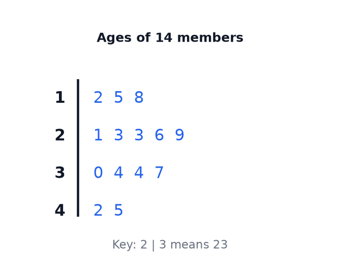
The ages are 12, 15, 18, 21, 23, 23, 26, 29, 30, 34, 34, 37, 42 and 45. There are 14 values, and they are already in order.
Reading the diagram
- Median With 14 values, take the mean of the 7th and 8th, 26 and 29, which gives \(\dfrac{26 + 29}{2} = 27.5\).
- Mode 23 and 34 both occur twice, so there are two modes.
- Range \(45 - 12 = 33\).
- Aged 30 or over The bottom two rows give \(4 + 2 = 6\) members.
Finding the median
A stem-and-leaf diagram shows the masses of 13 parcels in kilograms. Stem 1 has leaves 3 and 7. Stem 2 has leaves 0, 4, 4, 5 and 8. Stem 3 has leaves 1, 3, 6 and 9. Stem 4 has leaves 2 and 5. The key says that stem 2 with leaf 4 means 24 kg. Find the median mass.
Show the solutionHide the solution
- 1 Count the values \(2 + 5 + 4 + 2 = 13\).
- 2 Find the position The median is the \(\dfrac{13 + 1}{2} = 7\)th value.
- 3 Count along the rows Stem 1 gives the 1st and 2nd values, and stem 2 gives the 3rd to 7th values: 20, 24, 24, 25, 28.
- 4 Read the 7th value The 7th value is 28, so the median is 28 kg.
Answer28 kg
Misleading charts
Examiners like to ask what is wrong with a chart.
-
A scale that does not start at zero
It makes small differences look large.
-
Uneven scales or bars
Bars with different widths, or scales that jump, are misleading.
-
A 3D effect
It distorts the sizes of bars and pie sectors.
-
Missing labels or a missing key
The reader cannot tell what the chart shows.
Test yourself
-
1
How do you find the angle for a sector?
Show answerHide answer
Frequency divided by total, times 360.
-
2
For 40 people, how many degrees represent each person?
Show answerHide answer
\(\dfrac{360}{40} = 9^\circ\).
-
3
What must every stem-and-leaf diagram have?
Show answerHide answer
A key.
-
4
How do you find the median from a stem-and-leaf diagram with 11 values?
Show answerHide answer
The 6th value.
-
5
Why might a bar chart be misleading?
Show answerHide answer
The scale may not start at zero, or the bars may be uneven.
Exam technique: charts
Be exact with angles and keys.
-
Measure angles accurately
Within 2 degrees is usually accepted.
-
Show your working
Write \(\dfrac{360}{40} = 9\) before multiplying.
-
Write the key
Stem and leaf diagrams must show it.
-
Say "compare" correctly
Use both averages and spread, and give figures.
Summary and exam focus
- A sector's angle is \(\dfrac{\text{frequency}}{\text{total}} \times 360^\circ\), and a frequency is \(\dfrac{\text{angle}}{360} \times \text{total}\).
- Bar charts compare categories, and a dual bar chart compares two groups.
- A stem-and-leaf diagram has ordered leaves and a key, and gives the median, mode and range.
- Check scales and labels for misleading features.
Exam focus
A pie chart shows the favourite drinks of 40 pupils. The angle for tea is \(135^\circ\). How many pupils chose tea? (2 marks) (2 marks)
Each pupil is \(\dfrac{360}{40} = 9^\circ\), so tea is \(\dfrac{135}{9} = 15\) pupils. Alternatively, \(\dfrac{135}{360} \times 40 = 15\). Either way, show the method.
Key terms
The words this lesson expects you to use. Each one is linked from the first place it appears above.
- Pie chart
- A circular chart where the angle of each sector represents its share of the total.
- Sector
- A slice of a pie chart.
- Bar chart
- A chart that uses bars of different heights to show frequencies.
- Dual bar chart
- A bar chart with two sets of bars side by side.
- Stem-and-leaf diagram
- A diagram that shows data by splitting each value into a stem and a leaf.
- Stem
- The first digit or digits of each value in a stem-and-leaf diagram.
- Leaf
- The last digit of each value in a stem-and-leaf diagram.
- Key
- A note that explains what the values in a chart or diagram mean.
- Frequency
- The number of times a value or category occurs.
Questions and answers
15 questions set on this lesson, with the mark schemes and model answers open.
45 students are asked how they travel to school. 18 walk, 15 take the bus, 9 cycle and 3 come by car. Calculate the angle for each type of travel in a pie chart. [3 marks]
Mark scheme — 3 marks available
- \(360 \div 45 = 8\) — M1
- At least two angles correct — A1
- \(144^\circ, 120^\circ, 72^\circ, 24^\circ\) — A1
Model answer
Each student is \(\dfrac{360}{45} = 8^\circ\). Walk: \(18 \times 8 = 144^\circ\). Bus: \(15 \times 8 = 120^\circ\). Cycle: \(9 \times 8 = 72^\circ\). Car: \(3 \times 8 = 24^\circ\).
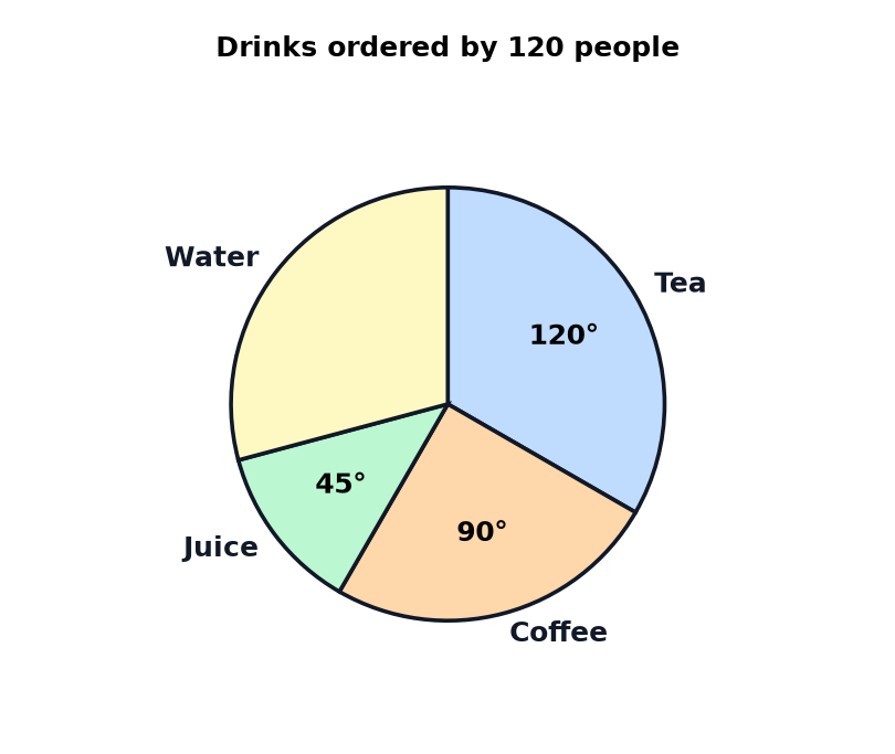
The pie chart shows the drinks ordered by 120 people in a cafe. The angle for water is not shown. (a) Calculate the number of people who ordered tea. [2 marks] (b) Calculate the angle for water. [1 mark] (c) Calculate the number of people who ordered water. [1 mark] (d) Write the sector for juice as a percentage of the whole pie chart. [1 mark]
Mark scheme — 5 marks available
- (a) \(\dfrac{120}{360} \times 120\) or \(120 \div 3\) — M1
- (a) 40 — A1
- (b) \(105^\circ\) — B1
- (c) 35 — B1
- (d) 12.5% — B1
Model answer
(a) Each person is \(\dfrac{360}{120} = 3^\circ\), so tea is \(\dfrac{120}{3} = 40\). (b) \(360 - 120 - 90 - 45 = 105^\circ\). (c) \(\dfrac{105}{3} = 35\). (d) \(\dfrac{45}{360} = 12.5\%\).
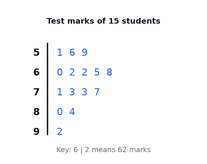
The stem-and-leaf diagram shows the marks of 15 students in a test. (a) How many students scored more than 70 marks? [1 mark] (b) Find the median mark. [1 mark] (c) Find the range. [1 mark] (d) Write down the modes. [1 mark]
Mark scheme — 4 marks available
- (a) 7 — B1
- (b) 68 — B1
- (c) 41 — B1
- (d) 62 and 73 — B1
Model answer
(a) The marks above 70 are 71, 73, 73, 77, 80, 84 and 92, which is 7 students. (b) There are 15 values, so the median is the 8th value, 68. (c) \(92 - 51 = 41\). (d) 62 and 73 each occur twice.
A graph has bars of different widths, and the horizontal scale jumps from 0 to 50 with no break shown. Give two reasons why the graph may be misleading. [2 marks]
Mark scheme — 2 marks available
- The bars have different widths — B1
- The scale is uneven or has a jump — B1
Model answer
Bars of different widths make the heights hard to compare, and the scale that jumps without a break gives a false impression of the sizes of the values.
A stem-and-leaf diagram shows the times, in minutes, of 10 runners. The stem 1 has leaves 3, 6 and 8. The stem 2 has leaves 0, 2, 2, 5 and 9. The stem 3 has leaves 1 and 4. The key says that 2 bar 0 means 20 minutes. (a) Write down the number of runners with a time of more than 25 minutes. [1 mark] (b) Find the median time. [2 marks]
Mark scheme — 3 marks available
- (a) 3 — B1
- (b) The 5th and 6th values identified — M1
- (b) 22 — A1
Model answer
(a) The times above 25 are 29, 31 and 34, so 3 runners. (b) In order: 13, 16, 18, 20, 22, 22, 25, 29, 31, 34. The 5th and 6th values are both 22, so the median is 22 minutes.
Pie chart A shows the travel of 60 people. The angle for tea is \(120^\circ\). Pie chart B shows the travel of 90 people. The angle for tea is \(100^\circ\). Compare the number of people who have tea in the two charts, and the proportion. [3 marks]
Mark scheme — 3 marks available
- \(\dfrac{120}{360} \times 60 = 20\) and \(\dfrac{100}{360} \times 90 = 25\) — M1
- A comparison of the numbers, 25 and 20 — A1
- A comparison of the proportions, with a conclusion — A1
Model answer
Chart A: \(\dfrac{120}{360} \times 60 = 20\) people, which is \(\dfrac{1}{3}\) of the people. Chart B: \(\dfrac{100}{360} \times 90 = 25\) people, which is \(\dfrac{5}{18}\) of the people. More people have tea in chart B, but a bigger proportion of the people have tea in chart A.
60 students choose a sport. 24 choose football. What is the angle for football on a pie chart?
Why: Each student is \(\dfrac{360}{60} = 6^\circ\), so \(24 \times 6 = 144^\circ\).
A pie chart shows 40 people. How many degrees represent each person?
Why: \(\dfrac{360}{40} = 9\).
A pie chart shows 36 people. A sector is \(100^\circ\). How many people does it represent?
Why: \(\dfrac{100}{360} \times 36 = 10\).
What fraction of a pie chart is a \(90^\circ\) sector?
Why: \(\dfrac{90}{360} = \dfrac{1}{4}\).
What must every stem-and-leaf diagram have?
Why: Without a key the values cannot be read.
A stem-and-leaf diagram has 14 ordered values. The 7th is 26 and the 8th is 29. What is the median?
Why: \(\dfrac{26 + 29}{2} = 27.5\).
The values in a stem-and-leaf diagram run from 12 to 45. What is the range?
Why: \(45 - 12 = 33\).
Which of these makes a bar chart misleading?
Why: A scale that does not start at zero exaggerates differences.
On a pie chart for 60 people, a sector is \(54^\circ\). What percentage is that?
Why: \(\dfrac{54}{360} = 0.15\).