Viewing as
Teaching this? The teacher view adds 2 files, the mark schemes and the model answers.
Maths · Interpreting and representing data
Scatter graphs
Do taller people have bigger feet? Do older cars sell for less? A scatter graph plots two measurements for each person or thing, and the shape of the points shows whether - and how strongly - the two are related.
Last Lesson and Before
Answer each one, then check.
-
1
Last lesson: what is a trend?
Show answerHide answer
The general direction of data over time.
-
2
Last lesson: what goes on the horizontal axis of a time series?
Show answerHide answer
Time
-
3
Plot \((4, 7)\): which way first?
Show answerHide answer
4 across, then 7 up.
-
4
Which is continuous: height or number of pets?
Show answerHide answer
Height
Learning Objectives
- 1Plot a scatter graph from two sets of data.
- 2Describe the correlation: positive, negative or none.
- 3Say whether correlation is strong or weak.
- 4Identify outliers.
- 5Explain that correlation does not prove that one thing causes another.
What Is a Scatter Graph?
A scatter graph shows two sets of data about the same people or things.
-
Bivariate data
Two measurements for each item: a student's height AND their shoe size.
-
One point each
Each item is one point, plotted using its two values as coordinates.
-
Do not join the points
The points are separate items; there is no order to follow.
-
Look at the shape
The pattern of the points shows whether the two measurements are related.
Types of Correlation
Positive correlation means as one value increases, so does the other. Negative correlation means as one increases, the other decreases. No correlation means there is no clear relationship at all.
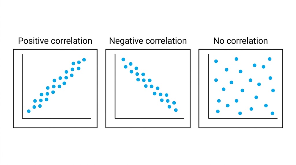
Up together, one up and one down, or no pattern at all.
Describing Correlation
-
Positive
As one goes up, the other goes up. Height and shoe size.
-
Negative
As one goes up, the other goes down. The age of a car and its value.
-
No correlation
No relationship. Height and score in a maths test.
-
Strong or weak
Strong: the points lie close to a straight line. Weak: they are more spread out but still show a pattern.
Outliers
An outlier is a point that does not fit the pattern of the rest.
-
Spotting one
A point well away from the others - for example, a very old car that is worth a lot because it is a classic.
-
Why it happens
A mistake in recording the data, or a genuinely unusual item.
-
What to do
Do not simply delete it. Note it, and think about why it is different.
-
In the exam
You may be asked to circle it or give its coordinates.
Correlation Is Not Causation
What correlation shows
- Two things tend to change together.
- It can help you make predictions.
- It can suggest an idea worth testing.
What it does NOT show
- That one thing causes the other.
- Ice cream sales and sunburn are positively correlated - but ice cream does not cause sunburn.
- Both are caused by a third thing: hot, sunny weather.
Case study
"Storks Deliver Babies"
In 2000 the statistician Robert Matthews published a paper called "Storks Deliver Babies (p = 0.008)". Using data from 17 European countries, he showed a genuine positive correlation between the number of breeding pairs of storks in a country and the number of babies born there each year. Of course storks do not deliver babies. Bigger countries simply have more room for storks AND more people having babies. His point was that a strong correlation, however convincing it looks, never proves that one thing causes the other.
Correlated or Not?
For each pair, predict the correlation (positive, negative or none) and say whether one could cause the other. (a) Temperature outside and number of hot drinks sold. (b) Hours of revision and test score. (c) Arm span and height. (d) House number and number of people living there. (e) Number of firefighters at a fire and the damage done.
1. Predict the correlation.
2. Decide if one causes the other.
3. Look for a hidden third factor.
A good answer shows: (a) Negative; plausibly causal. (b) Positive; plausibly causal, but other factors matter. (c) Strong positive; both depend on body size. (d) None. (e) Positive - but firefighters do not cause damage: bigger fires need more firefighters AND cause more damage.
Can I...?
- 1Plot a scatter graph.
- 2Describe positive correlation.
- 3Describe negative correlation.
- 4Recognise no correlation.
- 5Say if correlation is strong or weak.
- 6Identify an outlier.
- 7Interpret correlation in context.
- 8Explain that correlation is not causation.
Summary & Exam Focus
- A scatter graph plots two measurements for each item; do not join the points.
- Correlation is positive, negative or none, and strong or weak.
- An outlier does not fit the pattern.
- Correlation does not prove causation: look for a third factor.
Exam focus
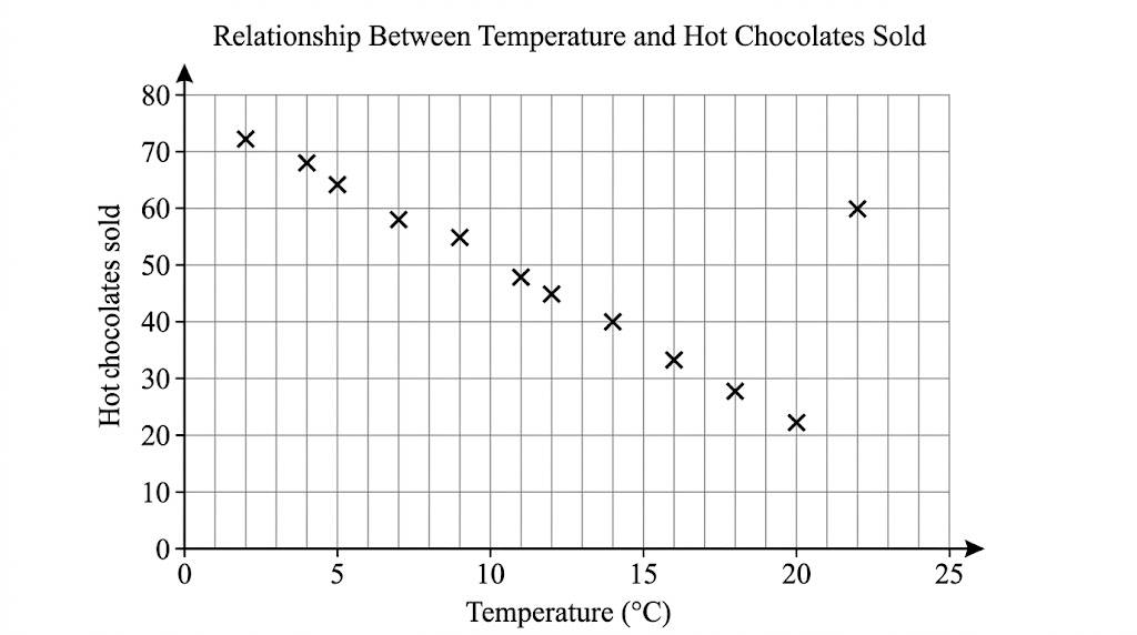
Describe the relationship between the temperature and the number of hot chocolates sold. (1 mark) (1 marks)
"Describe the relationship" wants a sentence in context: "as the temperature increases, the number of hot chocolates sold decreases". Just "negative" may not get the mark.
Key terms
The vocabulary this lesson expects you to use. Each one is linked from the first place it appears above.
- Scatter graph
- A graph plotting two sets of data about the same items as points.
- Bivariate data
- Data with two values for each item.
- Correlation
- A relationship between two sets of data.
- Positive correlation
- As one value increases, the other increases.
- Negative correlation
- As one value increases, the other decreases.
- Outlier
- A value that does not fit the pattern of the rest of the data.
Practice questions
Have a go at each one before you open its answer.
-
Question 1 Calculator 3 marks
The scatter graph shows the midday temperature and the number of hot chocolates sold by a café on 12 days. (a) What type of correlation does the graph show? (b) One of the points is an outlier. Write down its coordinates. (c) Describe the relationship between the temperature and the number of hot chocolates sold.
Show answerHide answer
Model answer
(a) Negative correlation. (b) \((22, 60)\). (c) As the temperature increases, the number of hot chocolates sold decreases.
Mark scheme
- (a) Negative — B1
- (b) \((22, 60)\) — B1
- (c) A statement in context, e.g. the warmer it is, the fewer hot chocolates are sold — C1
-
Question 2 Calculator 2 marks
Data from one summer shows positive correlation between ice cream sales and the number of people with sunburn. Jo says, "Eating ice cream causes sunburn." Is Jo correct? Explain your answer.
Show answerHide answer
Model answer
No. Correlation does not show that one causes the other. Both ice cream sales and sunburn increase because of a third factor - hot, sunny weather.
Mark scheme
- No, with a statement that correlation does not prove causation — C1
- A third factor identified, e.g. hot or sunny weather — C1
-
Question 3 Calculator 1 mark
Which of these pairs is most likely to show negative correlation? A: a person's height and their arm span. B: the age of a car and its value. C: a person's house number and their age.
Show answerHide answer
Model answer
B - as a car gets older, its value goes down.
Mark scheme
- B — B1
Quick check
-
As the age of a car increases, its value decreases. This is...
Show answerHide answer
B: Negative correlation
One goes up while the other goes down: negative correlation.
-
What is an outlier?
Show answerHide answer
D: A value that does not fit the pattern
An outlier is a value that does not fit the pattern of the rest of the data.
-
Two variables show strong positive correlation. What can you be sure of?
Show answerHide answer
A: They tend to increase together
Correlation shows the two tend to increase together, but never proves that one causes the other.
Downloads
Free to keep, print and annotate.
- Scatter graphs.pptx Built from the lesson script on 29 September 2026. View
- Scatter graphs - Completed Notes.docx The full notes for the lesson, to revise from. Built from the lesson script on 29 September 2026. View
- Scatter graphs - Exam Questions.docx Built from the lesson script on 29 September 2026. View
Something here looks wrong?
Tell us what and we will go and look. It goes to whoever writes these pages, nobody else, and we do not ask who you are — so there is nothing to sign and nothing comes back to you.