Viewing as
Teacher view: planning notes, the answers to every question, and the teacher copies of the files.
Maths · Interpreting and representing data
Statistical diagrams 2
Stem-and-leaf diagrams keep every value while showing the shape of the data; frequency polygons show grouped data as a line. Both are made for comparing - and some graphs are made, deliberately or not, to mislead.
Teacher resources
The teacher copies: slides with the questions built in, the answers, and anything else attached to this lesson for whoever is teaching it.
- Statistical diagrams 2 - Teacher Slides.pptx Teacher The lesson slides with the teacher's notes on each slide, and every question and mark scheme built in. Built from the lesson script on 29 September 2026. View
- Statistical diagrams 2 - Teacher Notes.docx Teacher The complete notes with the teacher's notes and every model answer in full. Built from the lesson script on 29 September 2026. View
Student handouts
The same files the students see, to print or hand out.
- Statistical diagrams 2.pptx Built from the lesson script on 29 September 2026. View
- Statistical diagrams 2 - Completed Notes.docx The full notes for the lesson, to revise from. Built from the lesson script on 29 September 2026. View
- Statistical diagrams 2 - Exam Questions.docx Built from the lesson script on 29 September 2026. View
Last Lesson
Answer each one, then check.
-
1
Find the median of 3, 5, 8, 10.
Show answerHide answer
6.5 - the mean of 5 and 8.
-
2
What is the range of 12, 4, 19, 7?
Show answerHide answer
\(19 - 4 = 15\)
-
3
What is a modal class?
Show answerHide answer
The class with the highest frequency.
-
4
What is the midpoint of the class \(20 < t \le 30\)?
Show answerHide answer
25
Learning Objectives
- 1Draw and read an ordered stem-and-leaf diagram, with a key.
- 2Find averages and the range from a stem-and-leaf diagram.
- 3Draw a frequency polygon for grouped data.
- 4Compare two sets of data using an average and the range.
- 5Recognise graphs that are misleading.
Stem-and-Leaf Diagrams
A stem-and-leaf diagram sorts data into order while keeping every value.
-
Stem and leaf
Split each value: for 73, the stem is 7 (the tens) and the leaf is 3 (the units).
-
Ordered
Write the leaves in order from smallest to largest along each row.
-
Key
Always include one, such as "7 then 3 means 73 beats per minute", written with a bar between the stem and the leaf.
-
Shape
Turned on its side, it looks like a bar chart of the data.
Resting Pulse Rates of 15 People
Key: 7 then 3 means 73 beats per minute.
-
5
Leaves: 8
-
6
Leaves: 2 5 7
-
7
Leaves: 0 1 1 3 6 8
-
8
Leaves: 0 2 5
-
9
Leaves: 1 4
Reading a Stem-and-Leaf Diagram
Use the pulse rate diagram to find the median, the mode and the range.
Show the solutionHide the solution
- 1 Count the values \(1 + 3 + 6 + 3 + 2 = 15\), so the median is the 8th value
- 2 Count along the leaves to the 8th 58, 62, 65, 67, 70, 71, 71, 73
- 3 The mode: the only repeated value 71
- 4 The range: largest − smallest \(94 - 58 = 36\)
AnswerMedian 73, mode 71, range 36 beats per minute
Back-to-Back Stem-and-Leaf Diagrams
Two sets of data share one stem, with one set's leaves on each side.
-
Layout
The stem runs down the middle. The leaves of one set go to the right; the other set's go to the left.
-
Reading the left side
The leaves on the left are read from the stem outwards: a leaf 4 by stem 6 on the left means 64.
-
Two keys
One for each side, so there is no confusion.
-
Why
Two groups can be compared at a glance - for example, pulse rates before and after exercise.
Drawing a Frequency Polygon
A frequency polygon plots the midpoint of each class against its frequency.
-
Midpoints
Work out the midpoint of each class.
-
Plot
Plot (midpoint, frequency) for each class.
-
Join
Join the points with straight lines. Do not join the last point back to the first.
-
Compare
Two frequency polygons on the same axes compare two sets of data clearly.
A Frequency Polygon
This is the journey time data from last lesson. The peak at 15 minutes shows the modal class, \(10 < t \le 20\), straight away. Drawing a second polygon on the same axes - say, for another year group - would let you compare the two.
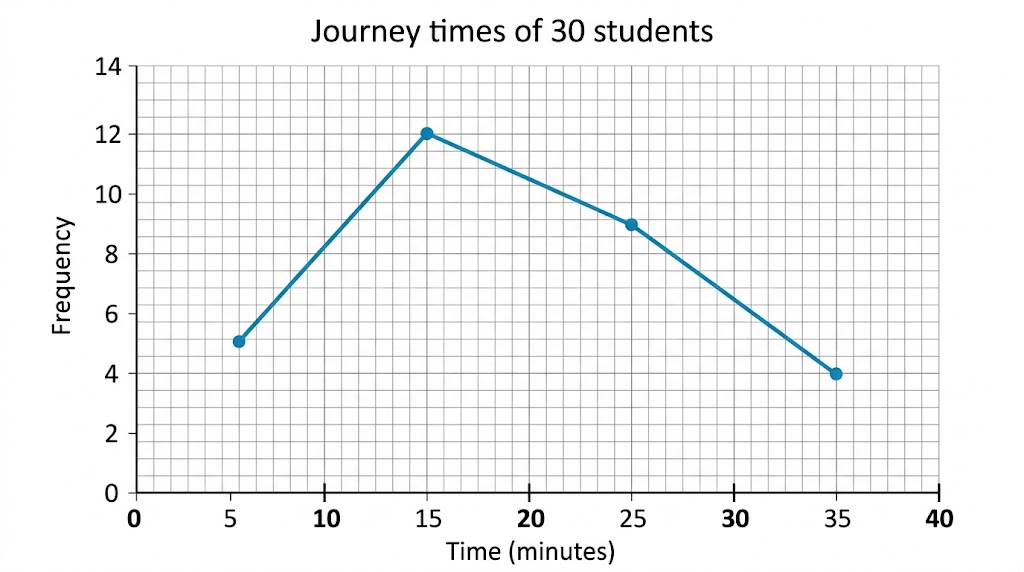
Each point sits above the middle of its class.
Comparing Distributions
To compare two sets of data, always compare an average AND a measure of spread - in context.
-
An average
"The median pulse rate after exercise (112) is higher than before (73), so pulse rates were higher on average after exercise."
-
The spread
"The range after exercise (22) is smaller than before (36), so the pulse rates after exercise were more consistent."
-
In context
Use the words of the question: "pulse rates", not "the data".
-
Two sentences
One for the average, one for the spread - that is what most mark schemes want.
Spot the Trick
Sales rose from 92 to 98 - about 6%. Start the axis at 90 and the rise looks enormous. Look out for axes that do not start at zero, uneven scales, missing labels, and 3D charts that make the nearest sections look bigger.
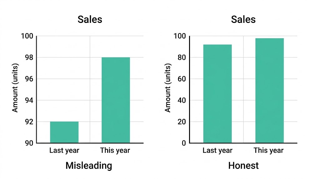
The same numbers, two very different impressions.
Before and After
Measure your resting pulse for 15 seconds and multiply by 4. Then do 1 minute of star jumps and measure it again. Collect the class results and draw a back-to-back stem-and-leaf diagram of "before" and "after". Find the median and range of each, and write two sentences comparing them.
1. Collect the data.
2. Draw the back-to-back diagram with keys.
3. Find the median and range of each.
4. Compare in two sentences.
A good answer shows: A back-to-back diagram with ordered leaves and two keys; medians and ranges for both sets; one comparison of the medians and one of the ranges, both in context.
Can I...?
- 1Draw an ordered stem-and-leaf diagram with a key.
- 2Find the median and range from a stem-and-leaf diagram.
- 3Read a back-to-back stem-and-leaf diagram.
- 4Draw a frequency polygon.
- 5Compare two data sets using an average.
- 6Compare two data sets using the range.
- 7Write comparisons in context.
- 8Explain why a graph is misleading.
Summary & Exam Focus
- Stem-and-leaf: ordered leaves and a key; it keeps every value.
- Frequency polygon: plot (midpoint, frequency) and join with straight lines.
- Compare with an average AND a measure of spread, in context.
- Misleading graphs: check that the axes start at zero and the scales are even.
Exam focus
Compare the times taken by the two groups. (2 marks) (2 marks)
Two marks means two comparisons: one about an average (which is higher) and one about the spread (which is more consistent), both in the context of the question.
Key terms
The vocabulary this lesson expects you to use. Each one is linked from the first place it appears above.
- Stem-and-leaf diagram
- A diagram that orders data by splitting each value into a stem and a leaf.
- Key
- The line that explains how to read a diagram, e.g. 7 then 3 means 73.
- Frequency polygon
- A graph joining points plotted at the midpoints of classes against their frequencies.
- Distribution
- How the values of a set of data are spread out.
- Misleading graph
- A graph that gives a false impression of the data.
Questions and answers
8 questions set on this lesson, with the mark schemes and model answers open.
Here are the times, in seconds, that 12 students took to solve a puzzle: 23, 35, 41, 28, 32, 45, 38, 26, 31, 40, 36, 29. Draw an ordered stem-and-leaf diagram to show this information.
Mark scheme — 3 marks available
- A correct stem-and-leaf diagram with the leaves in order — B2
- A correct diagram with the leaves not in order, or one error — B1
- A correct key — B1
Model answer
Stem 2: 3 6 8 9. Stem 3: 1 2 5 6 8. Stem 4: 0 1 5. Key: 2 then 3 means 23 seconds.
For the puzzle times in the last question, find (a) the median (b) the range.
Mark scheme — 2 marks available
- (a) 33.5 — B1
- (b) 22 — B1
Model answer
(a) In order: 23, 26, 28, 29, 31, 32, 35, 36, 38, 40, 41, 45. The median is \(\dfrac{32 + 35}{2} = 33.5\) seconds. (b) \(45 - 23 = 22\) seconds.
A second group of students solved the same puzzle. Their median time was 38 seconds and their range was 15 seconds. Compare the times of the two groups.
Mark scheme — 2 marks available
- A correct comparison of the medians, in context — C1
- A correct comparison of the ranges, in context — C1
Model answer
The first group had a lower median (33.5 s against 38 s), so on average they solved the puzzle faster. The second group had a smaller range (15 s against 22 s), so their times were more consistent.
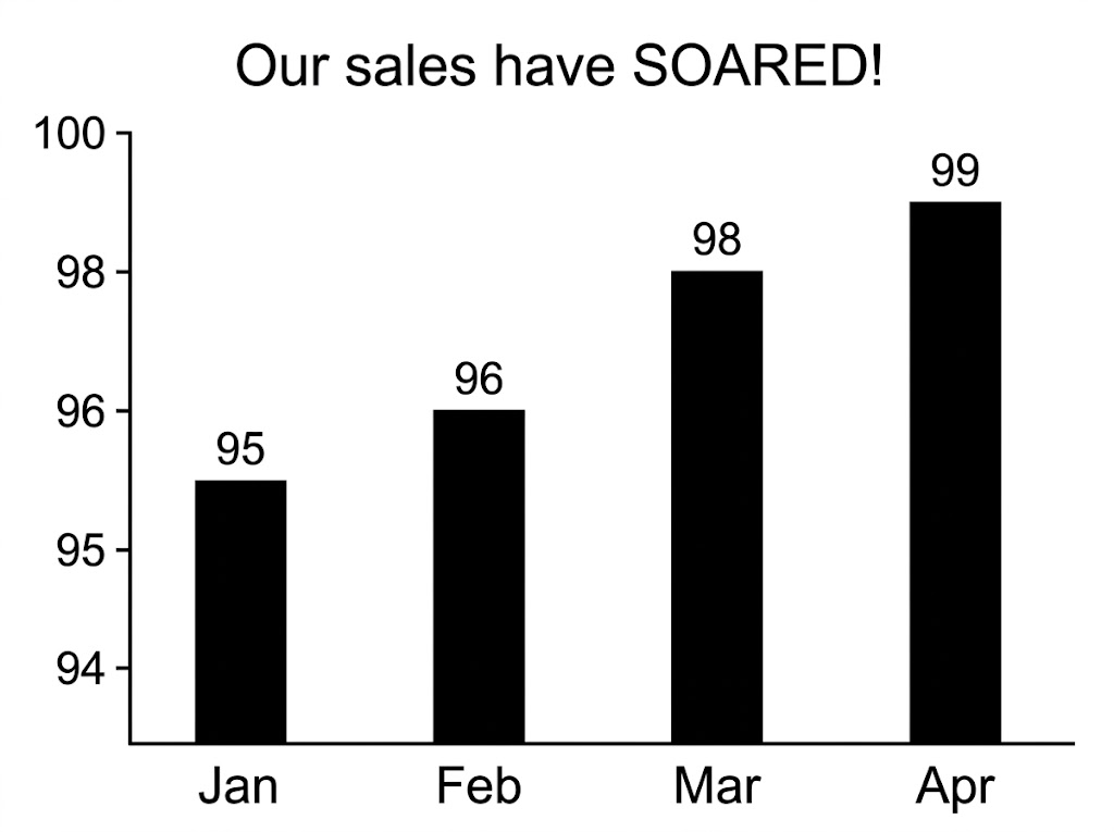
A company used this graph in an advert to show that its sales had "soared". Give two reasons why the graph is misleading.
Mark scheme — 2 marks available
- One valid reason, e.g. the axis does not start at 0 — C1
- A second valid reason, e.g. no axis label, or an uneven scale — C1
Model answer
The vertical axis does not start at zero, so the increase looks much bigger than it is. The vertical axis has no label or units, and the scale is uneven.
The table shows the heights, \(h\) cm, of 25 plants. \(0 < h \le 10\): 3 plants. \(10 < h \le 20\): 8 plants. \(20 < h \le 30\): 10 plants. \(30 < h \le 40\): 4 plants. Write down the coordinates of the points you would plot to draw a frequency polygon.
Mark scheme — 2 marks available
- All four points correct — B2
- Midpoints correct, or at least two points correct — B1
Model answer
\((5, 3)\), \((15, 8)\), \((25, 10)\), \((35, 4)\)
In a stem-and-leaf diagram where 4 then 7 means 47, what does stem 6 with leaf 2 mean?
Why: The stem is the tens and the leaf is the units: 62.
Where are the points of a frequency polygon plotted?
Why: Each point is plotted at the midpoint of its class, at the height of its frequency.
Which is the best way to compare two sets of data?
Why: Compare an average and a measure of spread, and write both in context.